Product & Interface
Light, clear and product-focused
- White or #F4F3FB backgrounds
- #8175CE for actions and selected states
- Minimal decoration and functional type
Choose the deliverable first. Use the production routes for format rules, then use the audited static-creative library to separate strong ideas from execution mistakes.
The modes share one identity but solve different problems. Use Product Mode for tasks and Campaign Mode for attention.
 Discover products
 SHOP
SHOPThe whole preview is clickable, so artwork normally should not include a button. Use one clear value proposition and generous central protection.
AFRICA’S PRODUCT DISCOVERY MARKETPLACE


Africa’s Product Discovery Marketplace · Buy From Vendors Near You · Shop Your City · Discover Products Near You · Find It Locally
General previews show a controlled category mix. Avoid social icons, paragraphs, buttons and tiny screenshots. Keep all essentials inside the safe area.
Slide one creates curiosity; interior slides deliver value; the final slide resolves the idea and may offer one next step.
A short question, tension or clear benefit.
One idea per slide and useful numbering.
Summarize or introduce Enomy naturally.
1080×1350 · 4:5 · 80 px safe area.
Open with a message, not a long logo reveal. Use smooth movement, captions and enough time to read.
1080×1920 · 1920×1080 · 1080×1080. Compose independently.
Deep title cards, one yellow moment and a brief logo animation.
Caption every video, protect platform UI zones and keep demos legible.
Transactional communication stays light. Promotional communication may use a simplified campaign header with one CTA.
Product Mode, clear status language and minimal imagery.
Your shop is ready to share.
Dark-purple header; WhatsApp green only on the chat action.
Help shoppers discover your products.
Avoid emojis in campaign headlines, UI labels and core statements. One appropriate emoji may appear sparingly in conversational WhatsApp, email or lifecycle messages.
Marketing heroes may use the dark campaign system. Once users browse, compare or complete tasks, transition to light product surfaces.
Dark gradient, white/yellow headline, one CTA and a local shopper or vendor.
Real categories and actual Enomy UI. All claims require approval.
Product Mode for search, cards, shops and forms.
The universal voice is direct, plain and audience-first. Its emphasis changes for shoppers, vendors and neutral platform communication.
Helpful, discovery-focused and locally relevant.
Discover products in Lagos.
Encouraging and growth-focused without promising sales.
Let’s help more shoppers discover your products.
Clear, trustworthy and neutral.
Your product has been added to your shop.
Use “Africa’s Product Discovery Marketplace.” Do not use “fastest growing,” guaranteed sales, fake reviews, badges, vendor counts or shopper counts.
These screens and states define the minimum UI coverage. Reuse Enomy controls, spacing, type and the complete category icon library.
All 33 current category assets · use original artwork without recolouring
Minimum product-design coverage
Generate photography without text, logos, fake UI or watermarks. Add the real brand and interface in production.
A focused production guide for social advertisements, campaign posts and promotional graphics. Use the reference work to learn what to retain, what to simplify and what must never ship.
A static creative must still read when viewed as a small feed thumbnail. If every element is asking for attention, none of them is leading.
One shopper or vendor benefit. Supporting copy explains; it does not introduce a second campaign.
Prioritize one person, one product group or one phone/interface—not all three at equal scale.
Highlight one power word or short phrase. Yellow does not become the default for badges, icons and buttons.
Counts, verification, trust and growth language require accurate, current approval before publication.
These are working references, not approved masters. Each contains useful ingredients, but none should be reproduced unchanged.
Every reference uses the same decision format so people and AI systems can separate the useful concept from the execution flaws. These are critique materials, not finished templates.
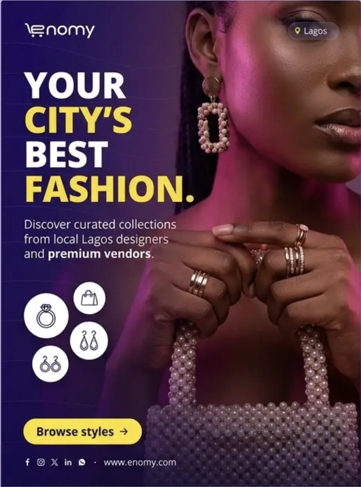
A tight editorial crop where earrings, rings and bag texture remain unmistakable.
Cropping essential product details, excessive beauty retouching and too many category icons.
AI direction: use for jewelry or accessories, not general marketplace messaging.
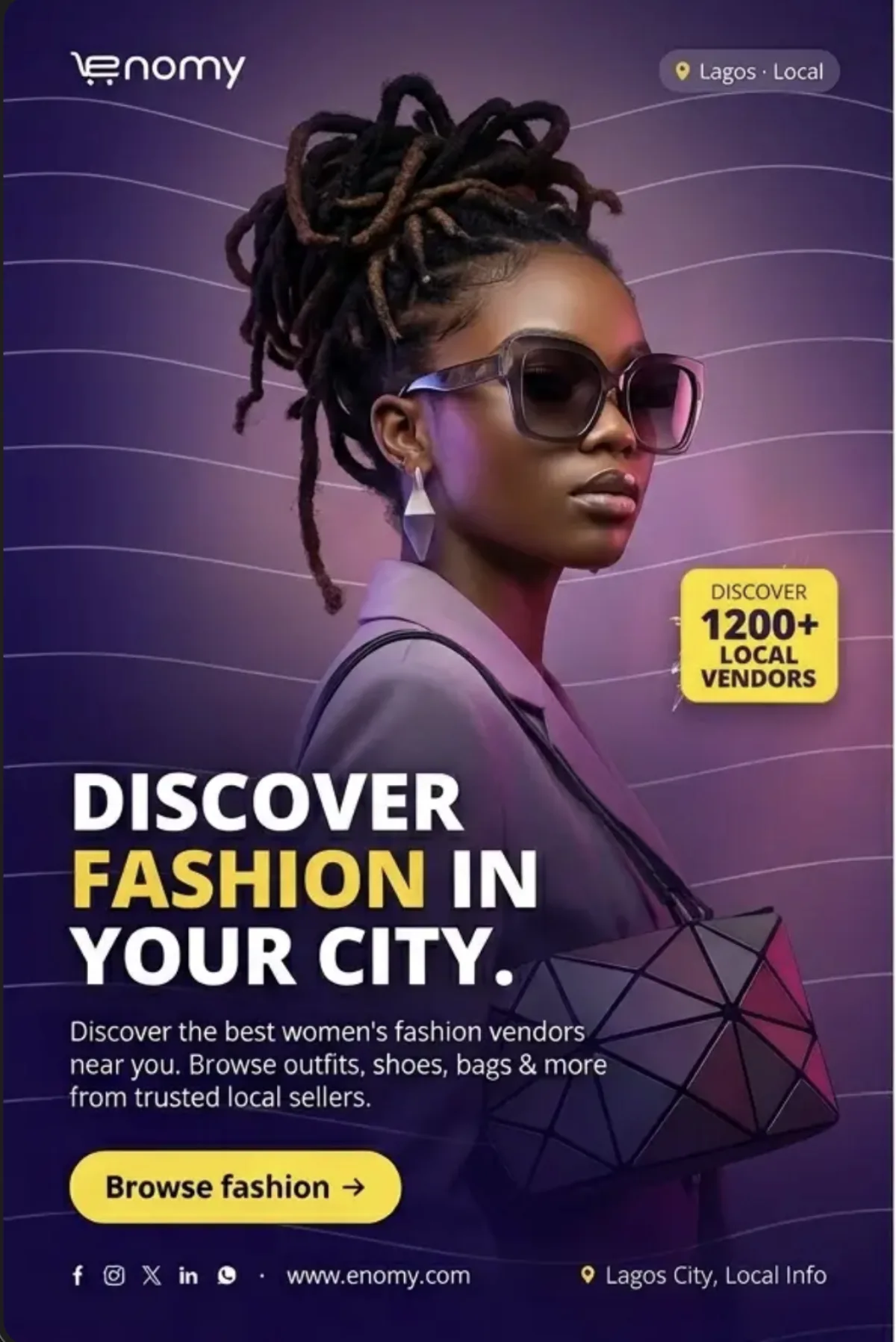
A memorable hairstyle, one eyewear story and one geometric bag that support a focused accessories message.
Plastic sunglasses, impossible hair structure, wavy decorative lines and a product competing with the face.
AI direction: use authentic styling and select one accessory as the commercial hero.
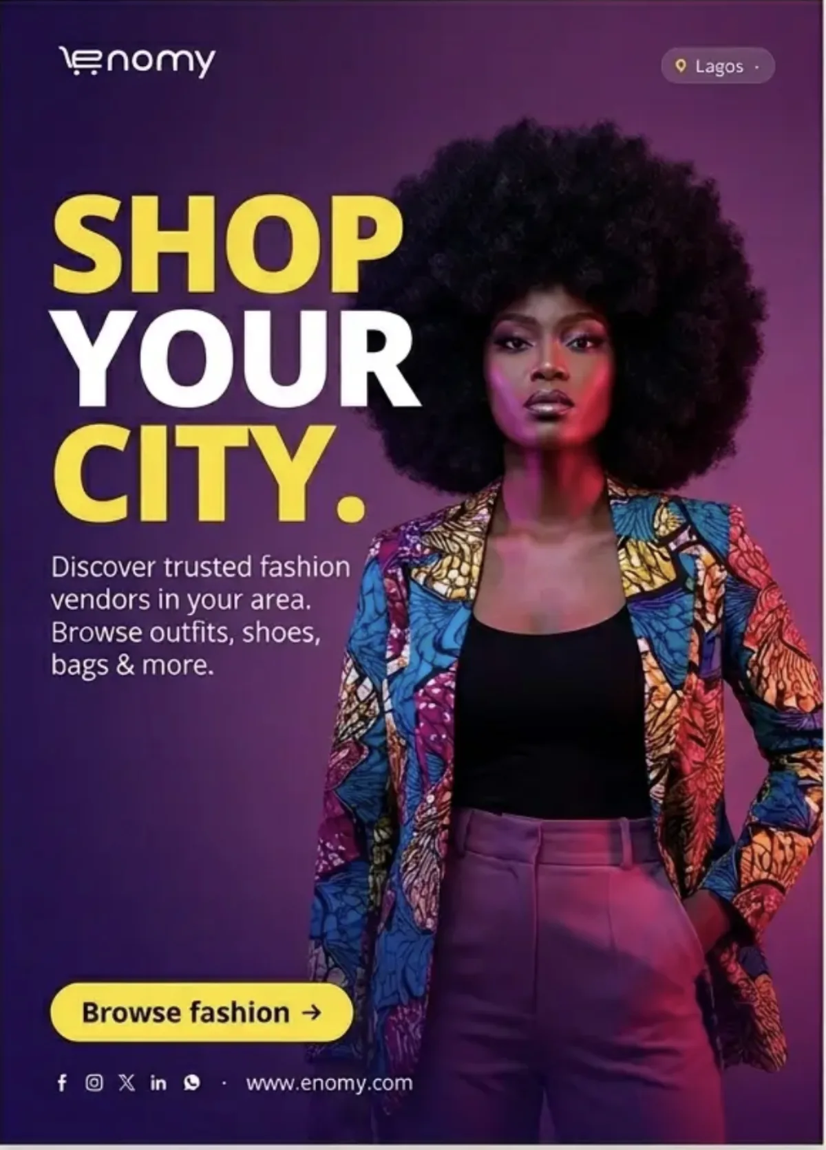
A strong natural-hair silhouette, confident eye contact and enough negative space for one short message.
Yellow across half the headline, overly synthetic skin and generic fashion-only supporting copy.
AI direction: the subject provides the impact; keep everything else restrained.
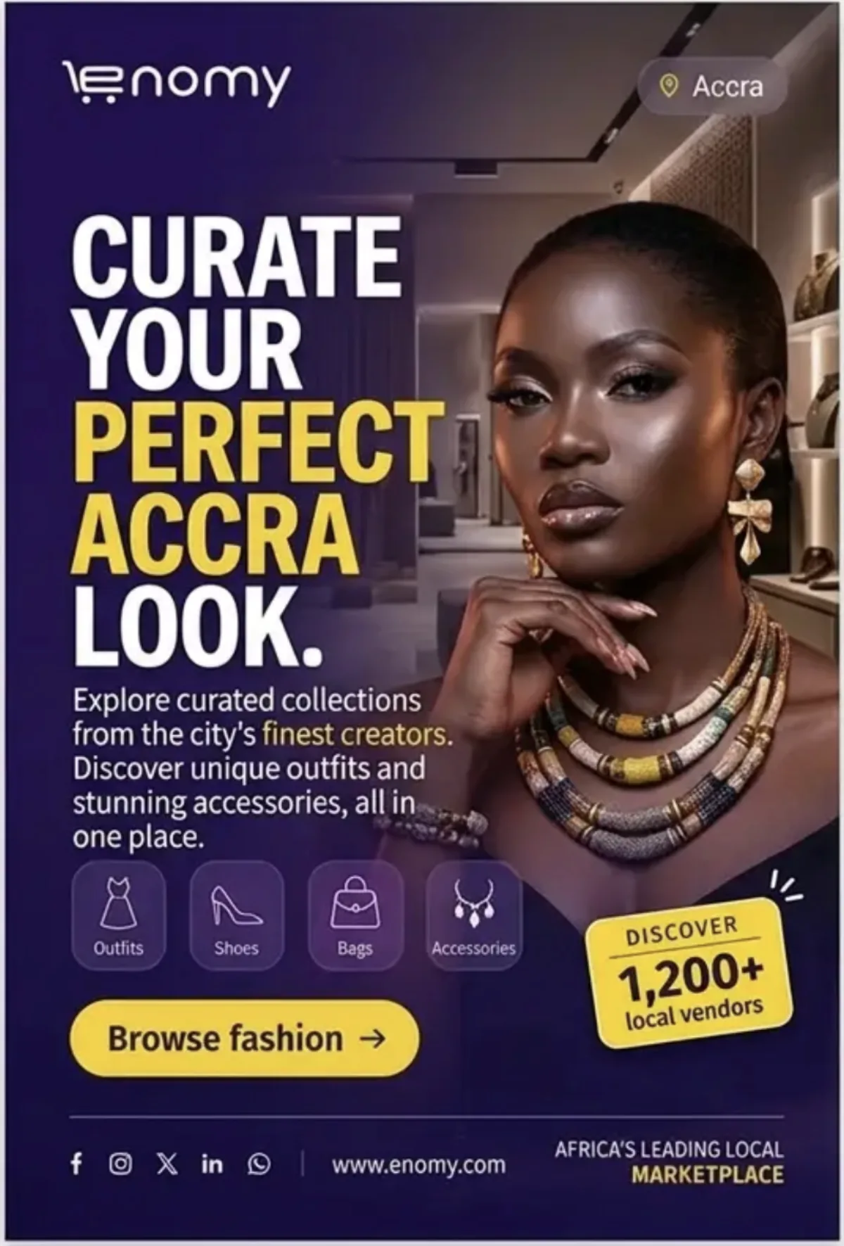
Close framing, warm metallic light and jewelry large enough to understand at thumbnail size.
Waxy skin, malformed hands, impossible jewelry construction and unrelated categories.
AI direction: one person, one jewelry story and natural material detail.

One handbag, two or three coordinated styling details and controlled purple lighting on a clean stage.
Luxury-brand mimicry, fake hardware, random jewelry piles, “best vendor” headlines and instant-purchase claims.
AI direction: one believable product should occupy most of the visual attention.

A carefully staged product family, controlled light and generous space for copy.
Duplicate products, impossible shadows, unrelated items and repeated supporting copy.
AI direction: one coherent collection on a deep Enomy set.

Warm natural light, premium product texture and a dark Enomy gradient for copy.
Brown replacing the brand canvas, luxury mimicry, random crops and “best vendor” claims.
AI direction: product warmth can contrast with, not replace, Enomy Night.
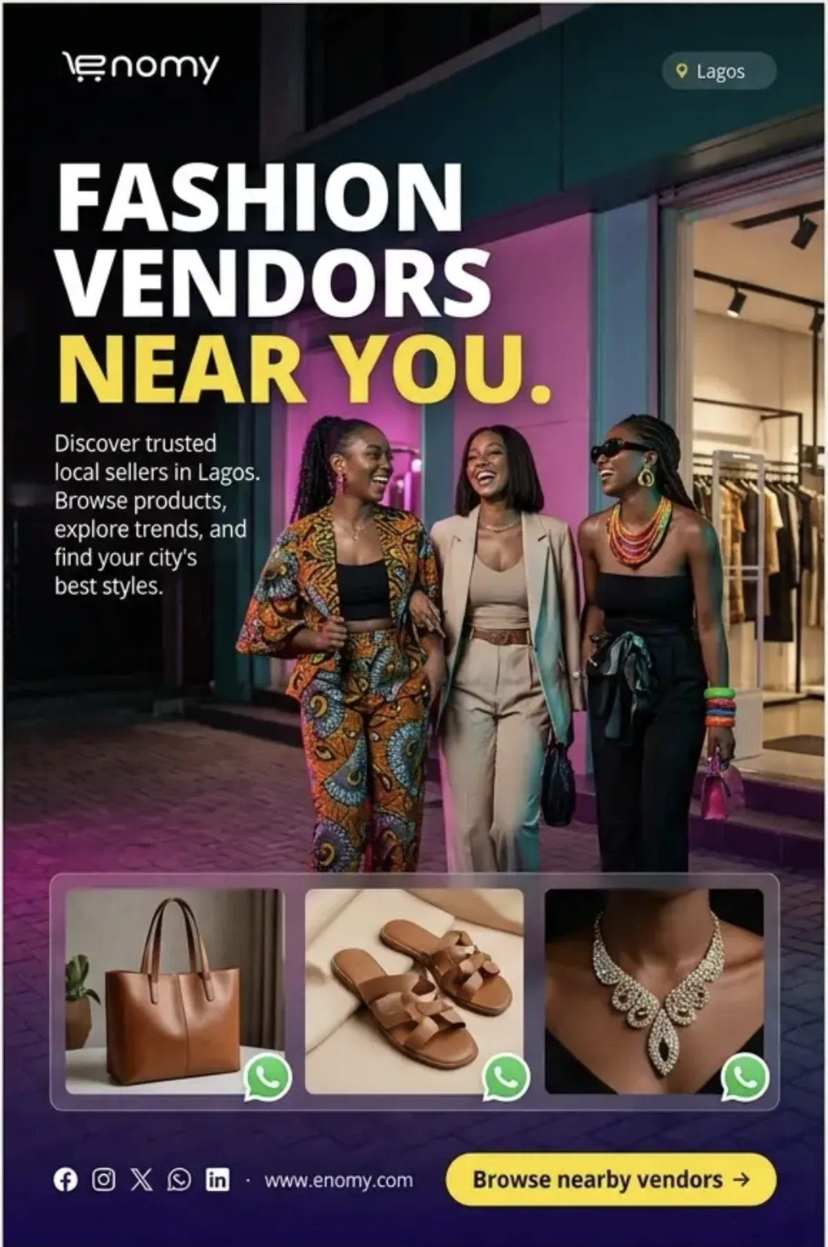
Two or three people in a natural storefront moment plus one restrained product strip.
Identical AI faces, unclear shop ownership, floating WhatsApp marks and visual crowding.
AI direction: candid community energy, not a posed cast lineup.

Real market details, accurate transport and a subject naturally moving through the environment.
AI shop signs, branded shopping bags, excessive magenta skin and generic market stereotypes.
AI direction: documentary Lagos first, brand colour grade second.

A natural walking pose, recognizable market texture and clothing that belongs in the environment.
Generic market stereotypes, staged shopping bags, unsafe street placement and category icons floating over the subject.
AI direction: documentary movement should feel observed, not posed for a studio campaign.
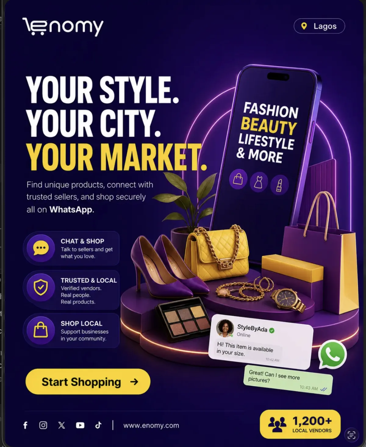
A compact product card and two-message exchange in the lower-right safe area.
Covering the CTA, oversized WhatsApp branding, fake profiles and unreadable bubbles.
AI direction: chat is the proof point, not the whole composition.

One legible phone, one real product and a clearly anonymized conversation.
Generated UI text, impossible device chrome, fabricated profiles and tiny screens.
AI direction: add accurate interface artwork during production.

A vendor arranging, inspecting or presenting real merchandise in a believable shop.
Generic modelling, awkward hand contact, floating products and broad fashion copy.
AI direction: tactile action should prove the category.
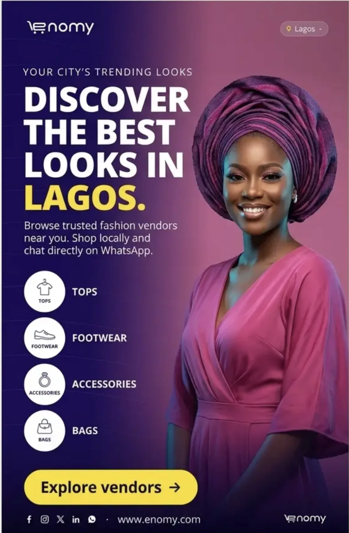
Accurate culturally specific styling, a dignified portrait and category cues that match the clothing or occasion.
Costume-like treatment, inaccurate headwear, artificial skin colour, duplicated logos and generic “best looks” claims.
AI direction: cultural details must be accurate, respectful and reviewed by someone with local knowledge.
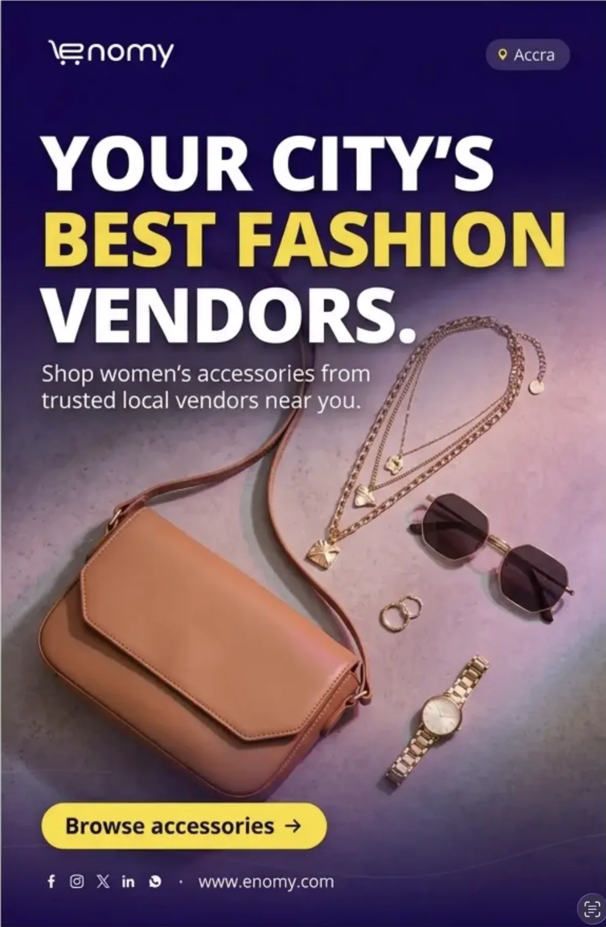
Three to five coordinated products, clean spacing and one directional light source.
Fake logos, inconsistent scale, warped jewelry, unverified “best” language and clutter.
AI direction: realistic materials and a deliberate editorial arrangement.

A distinct hairstyle or outfit silhouette and clean negative space for a short headline.
Over-stylized anatomy, crushed copy, fashion-only repetition and yellow across multiple lines.
AI direction: one confident stance, natural anatomy and simple composition.

A relaxed shopper, one featured product and a compact two-message conversation beside it.
Neon shop signs, an oversized WhatsApp logo, fictional vendor profiles and product cards floating without hierarchy.
AI direction: let the person establish desire and the chat explain the next action.
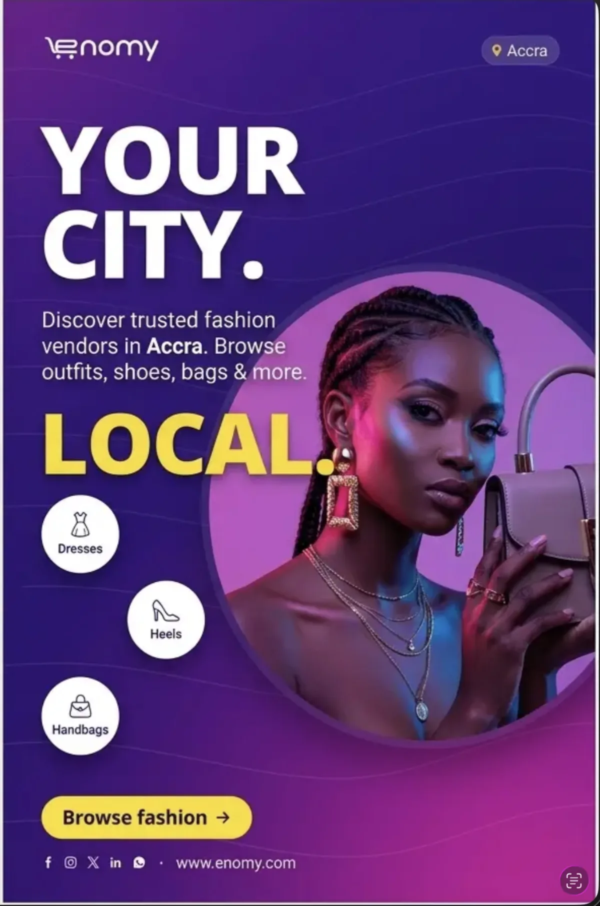
One large circle behind the subject and a short vertical run of relevant category cues.
Bright pink fields, category labels that compete with the headline and unrealistic hands.
AI direction: the circle supports the hero; it does not become decoration everywhere.
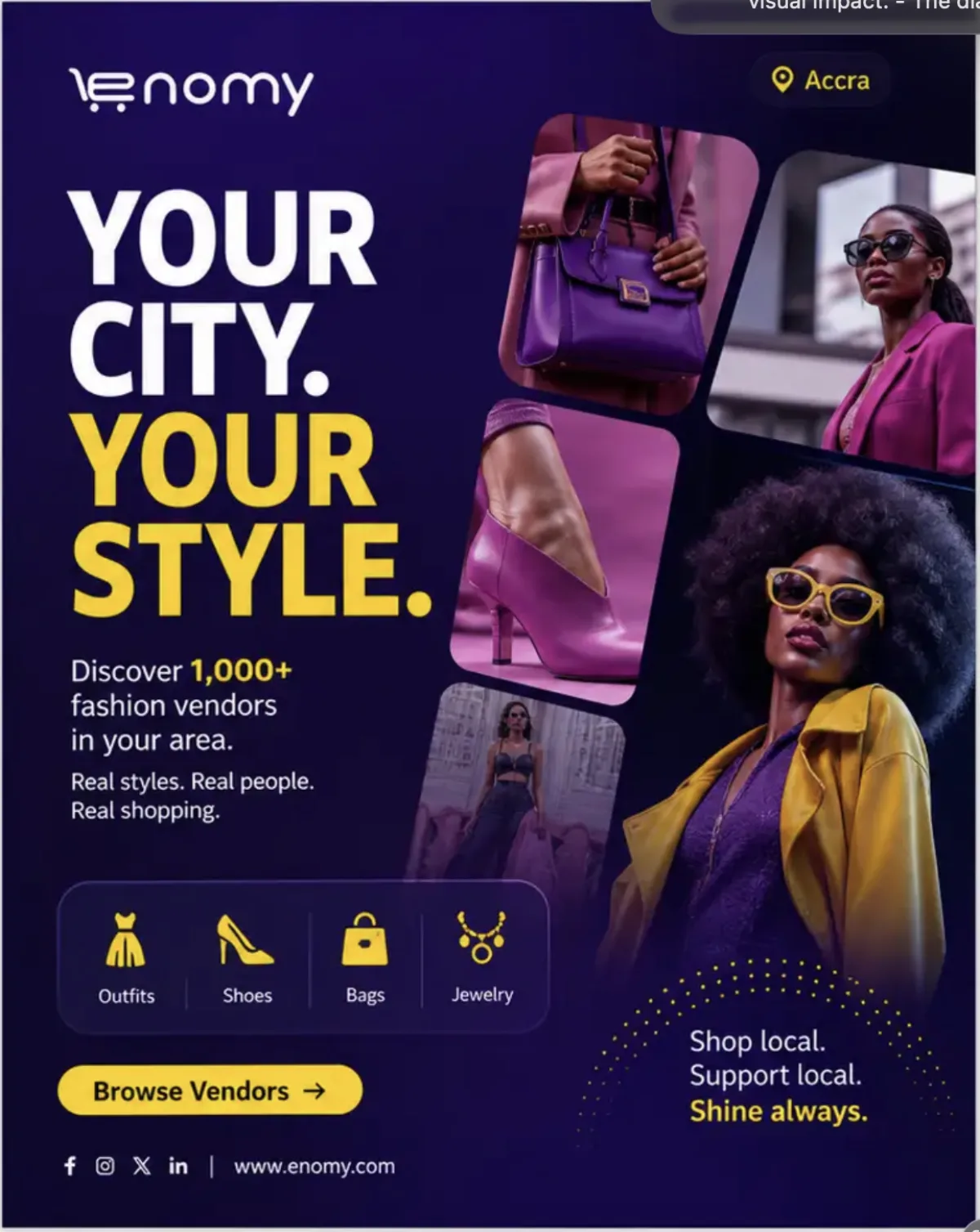
One dominant hero and up to three rounded detail tiles with consistent grading.
Equal-sized tiles, mixed lighting, repeated people and yellow on every supporting element.
AI direction: hierarchy first; variety second.
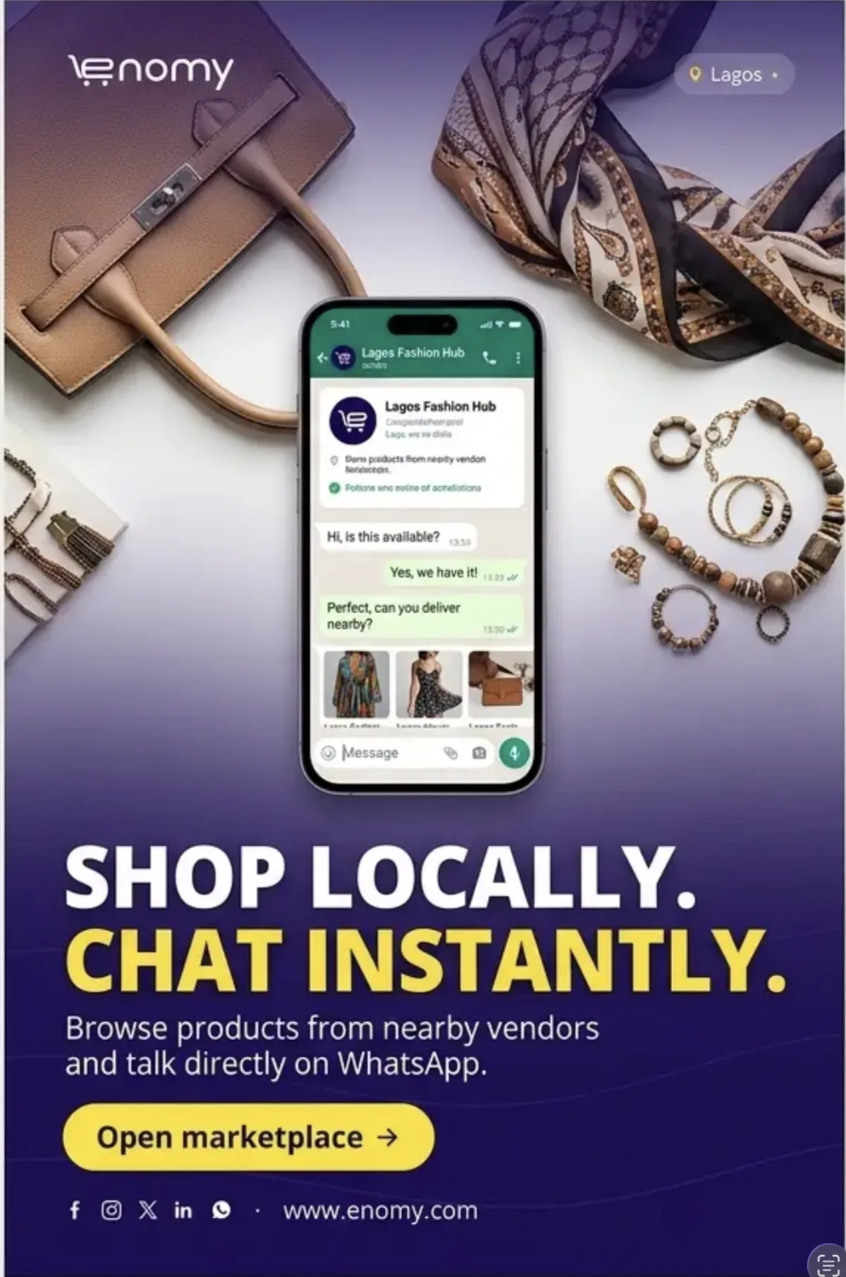
A clean overhead arrangement and one central phone showing the relevant product conversation.
Fake verification, delivery promises, too many props and unreadable generated interface text.
AI direction: composite approved chat UI after generating the still life.

Natural phone use, real street texture and a setting verified for the named city.
Generic “African” scenery, incorrect transport, staged shopping bags and off-brand colour.
AI direction: authentic environment with restrained Enomy grading.

Confident African shopper, clear Lagos cue, direct WhatsApp context, recognizable products and bold headline scale.
Excess yellow, generic bright-purple backgrounds, too many product tiles, repeated benefits, fabricated profiles and unsupported claims.
AI direction: one hero, one product story, one chat proof and one CTA.

One shopper benefit, moderate yellow and a compact WhatsApp cue connected to the product.
Plastic-looking characters, generic city backgrounds, fictional ratings and crowded vendor cards.
AI direction: one message, one CTA and one WhatsApp identifier.
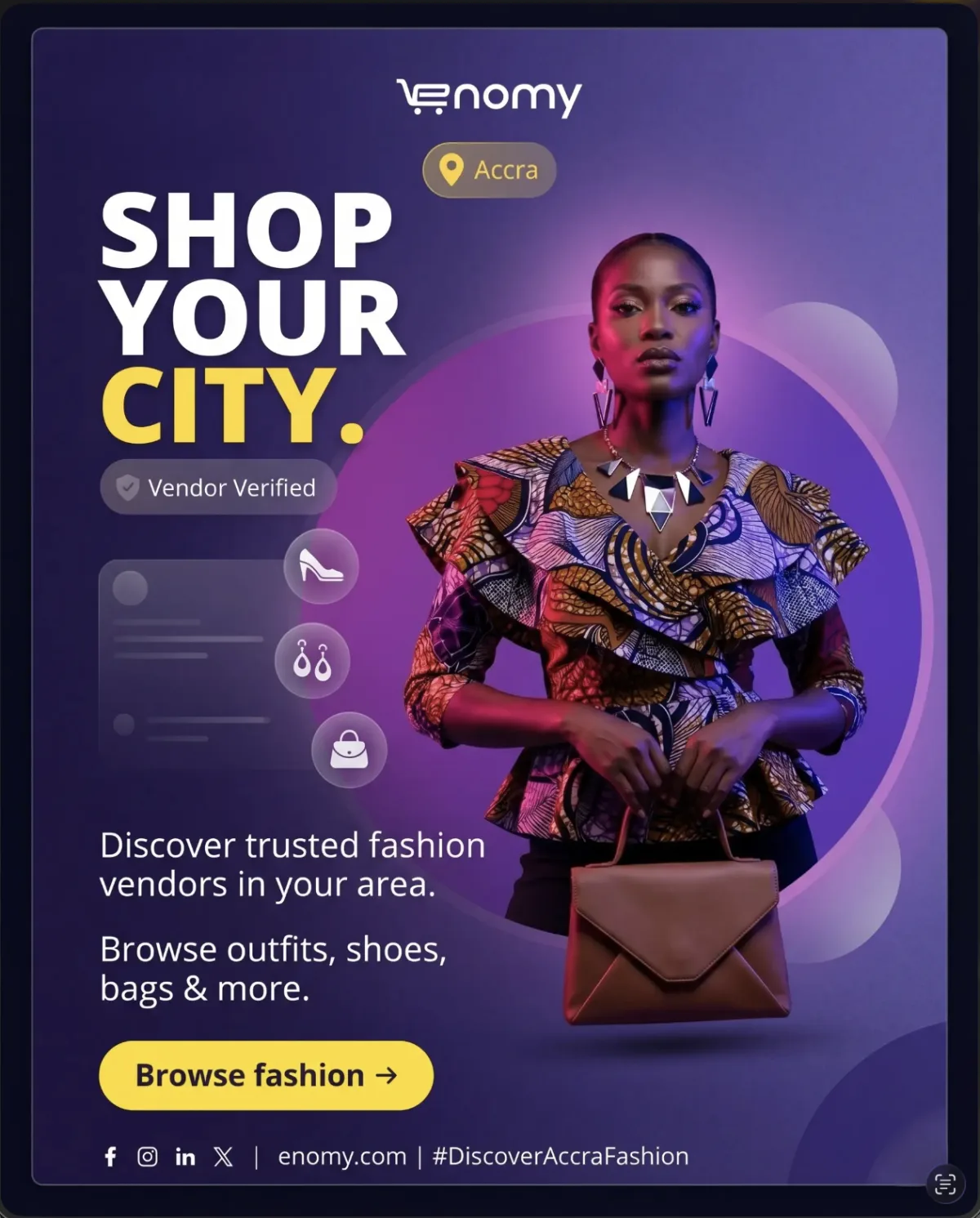
One large circular frame, a few translucent bubble shapes and a strong centered category portrait.
Flat bright-purple backgrounds, decorative circles over copy and too many floating category icons.
AI direction: build soft depth behind the person while protecting headline contrast.
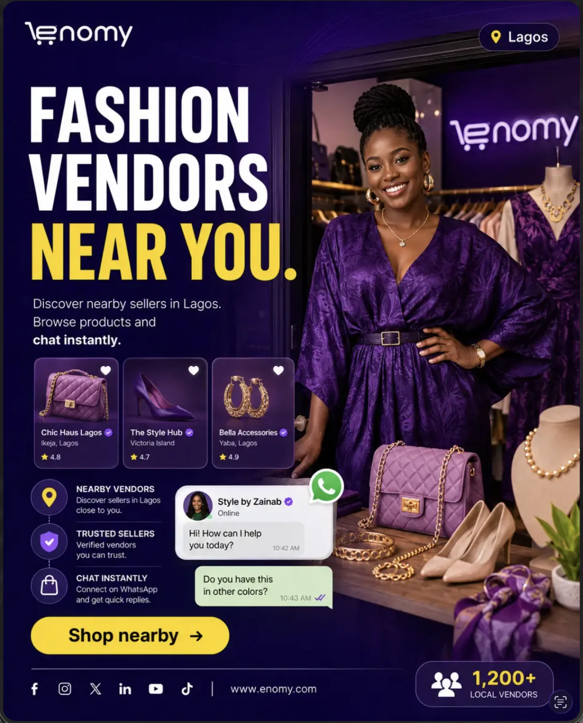
One shopper question and one vendor response about the same visible product.
Invented vendor identities, ratings, verification marks, counts and unrelated product cards.
AI direction: anonymized, legible and commercially realistic chat.

Accurate danfo buses, recognizable Lagos context and a deep-purple text protection overlay.
AI-distorted vehicles, generic skylines, unsupported vendor counts and delivery implications.
AI direction: local specificity must be geographically credible.

An accurate, identifiable landmark with enough negative space for the message.
Distorted landmark lettering, invented architecture, generic copy and checkout claims.
AI direction: verify the landmark before naming the city.

A believable person, category-rich shop context and a natural phone interaction.
Invented vendor cards, repeated copy, excessive props and a heavily artificial scene.
AI direction: environment should explain the category instantly.
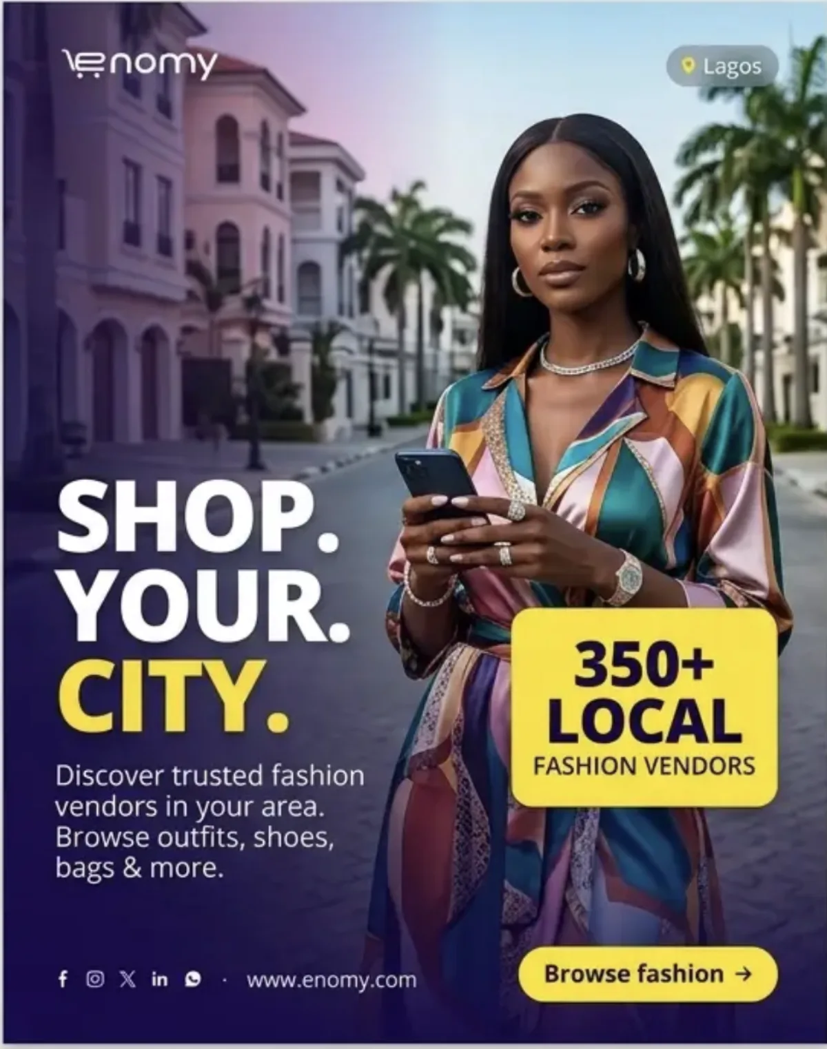
One approved fact or non-numeric category cue as the single yellow focal device.
Unverified counts, a yellow headline plus yellow card plus yellow CTA, and vague “trusted” claims.
AI direction: reserve the card until the fact is approved.
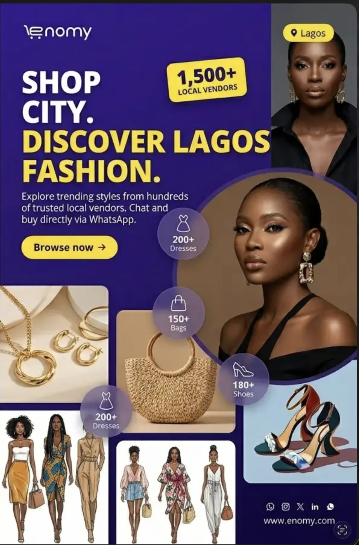
One portrait, two product modules and compact category labels in a repeatable grid.
Fabricated inventory counts, fashion sketches mixed with photography and six competing panels.
AI direction: use only when campaign breadth is the primary message.
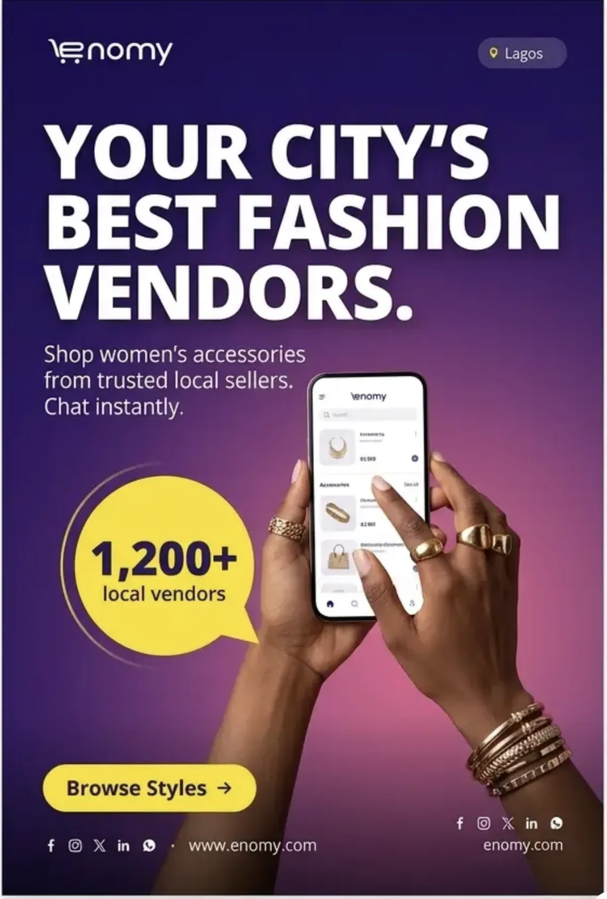
Natural hands, one clearly readable product screen and a non-numeric proof bubble if needed.
Malformed fingers, invented Enomy UI, “chat instantly” language and unsupported counts.
AI direction: generate hands and device only; composite real UI later.
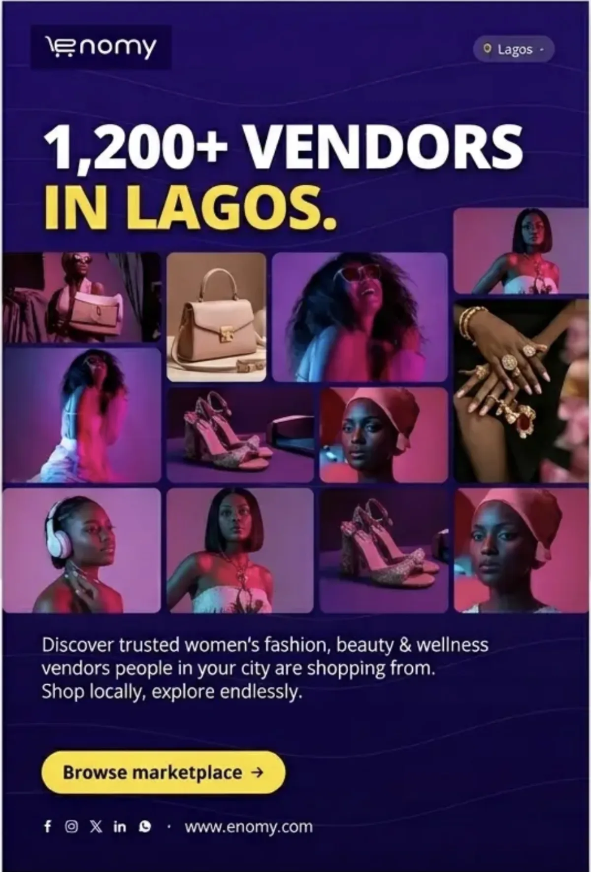
A diverse grid of real participating vendors or products and a vendor-focused onboarding CTA.
Unverified vendor counts, stock-model repetition and shopper copy in a vendor campaign.
AI direction: frame as social proof only when every fact and image is cleared.
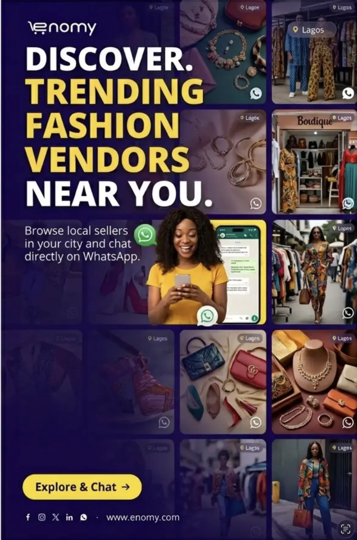
One text column plus a small, consistent grid of real vendor or product thumbnails.
Ten or more tiles, a WhatsApp mark on every image, tiny labels and inconsistent sources.
AI direction: maximum six tiles with one shared colour grade.

One central shopper and three or four clearly separated category products.
Products touching the face, floating badges, “top” claims and unrelated visual styles.
AI direction: circular hierarchy with products subordinate to the person.

One real vendor environment with up to three products visually connected to the shop.
Decorative connector lines, generated chat, mismatched products and dense WhatsApp headlines.
AI direction: make seller-to-inventory relationships obvious and credible.

An authentic Lagos street hero and one phone overlay tied to the shopper’s action.
Fake roadside signage, an oversized phone, illegible chat and headline collisions.
AI direction: let either city or phone lead; never give both equal weight.
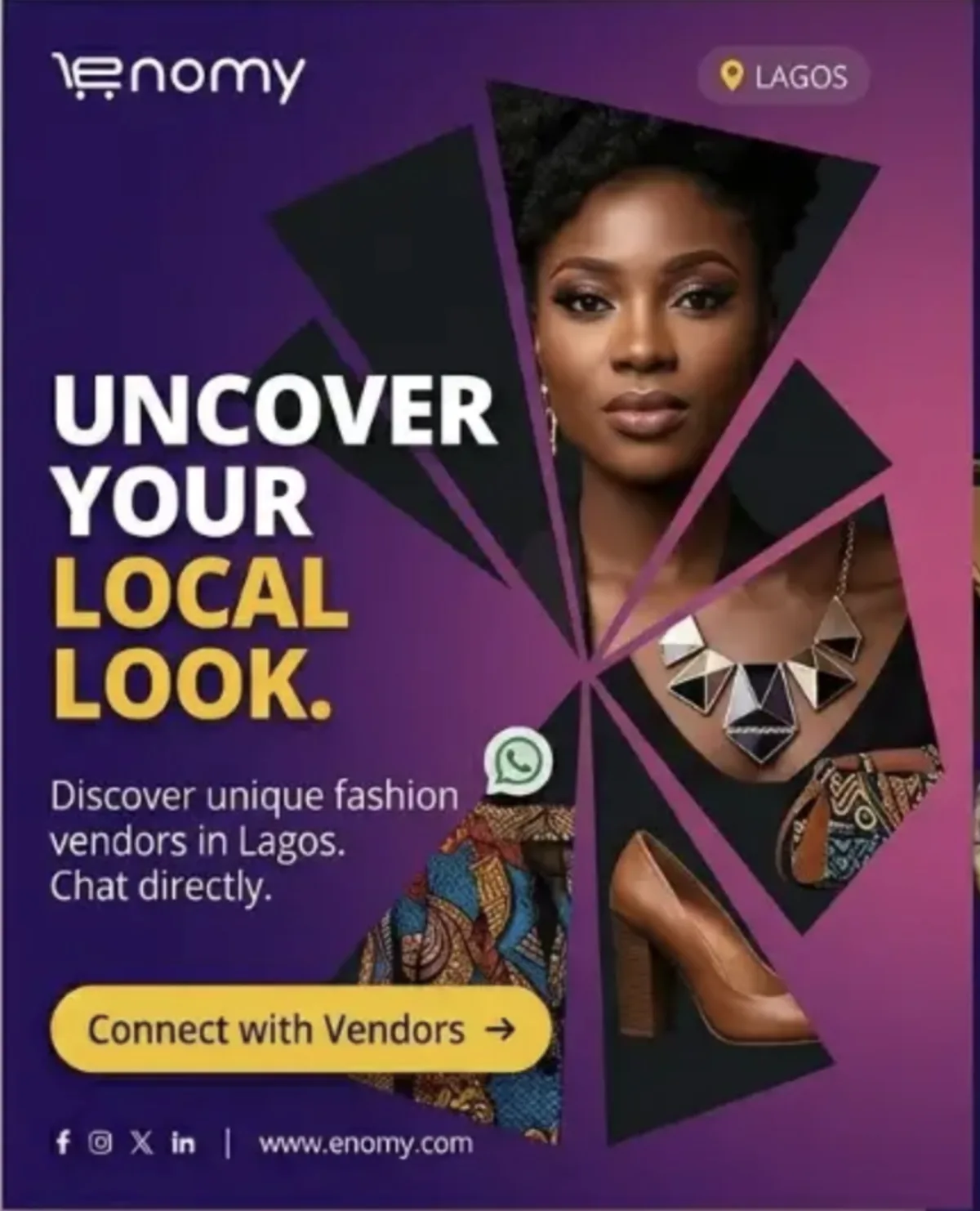
One repeated geometric form revealing a portrait and two category details.
Sharp fragments across the face, arbitrary angles, four competing products and weak legibility.
AI direction: use sparingly for editorial campaigns, not core templates.

Men’s fashion, grooming, footwear or accessories with category-appropriate styling.
Generic corporate suits labelled streetwear, fake maps, unexplained pins and fashion-only bias.
AI direction: match the person, setting and CTA to the actual category.
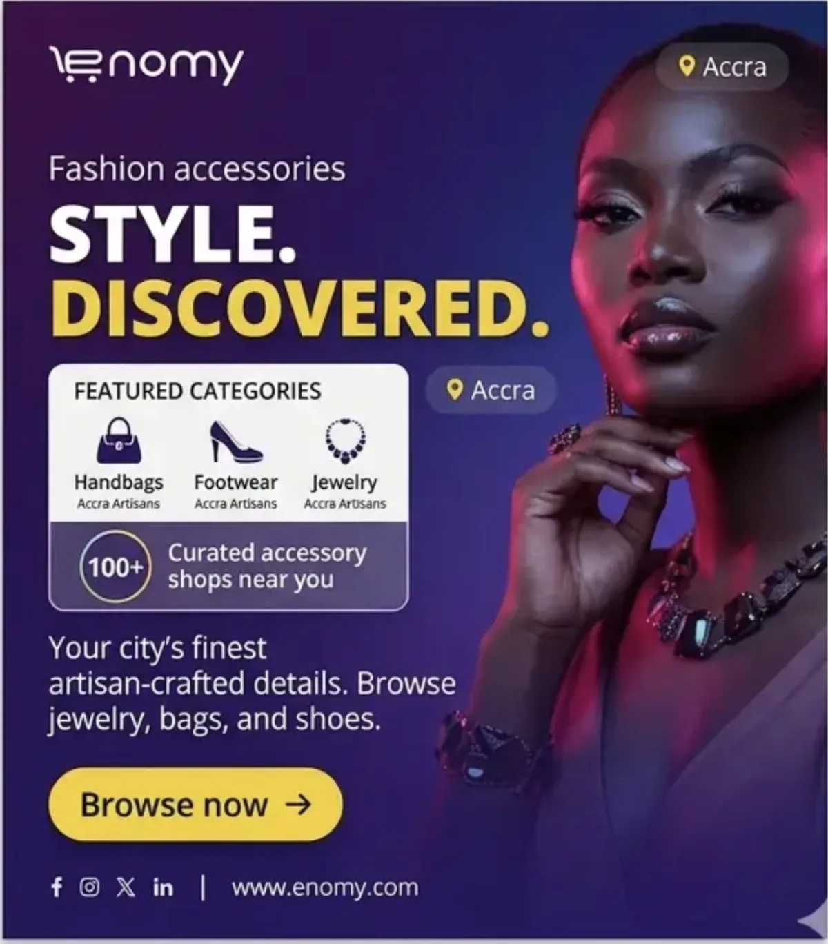
Two or three approved category icons with short labels and one clear location cue.
Invented artisan claims, unsupported shop counts, duplicate city chips and tiny sublabels.
AI direction: category panel is secondary support, never the headline.
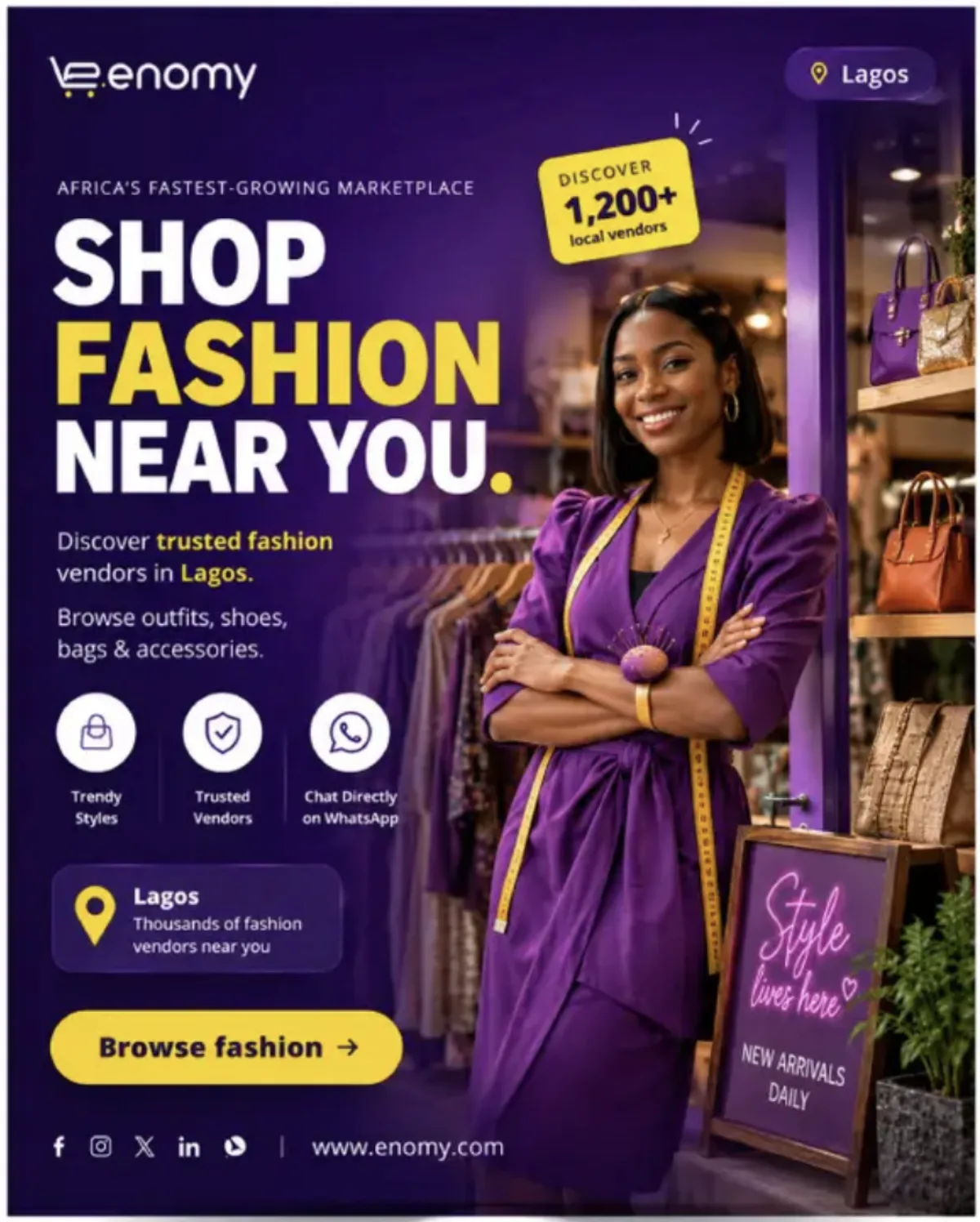
One yellow headline phrase, one yellow CTA and a recognizable boutique environment under purple depth.
Yellow badges, yellow icon circles, yellow location cards and unsupported vendor totals in the same layout.
AI direction: choose the headline or CTA as the dominant yellow moment, not both equally.

At most three approved icons for nearby vendors, direct chat and another verified product benefit.
Delivery promises, checkout claims, tiny captions, mismatched icon styles and a benefit row wider than the CTA.
AI direction: use Enomy’s actual icons and approved benefit language during production.

A seller or shopper holding one distinctive product while a small phone screen supports the story.
Generated phone text, duplicated product proof, an unrelated yellow badge and ambiguous seller-versus-shopper roles.
AI direction: make the physical product the hero and add accurate UI later.
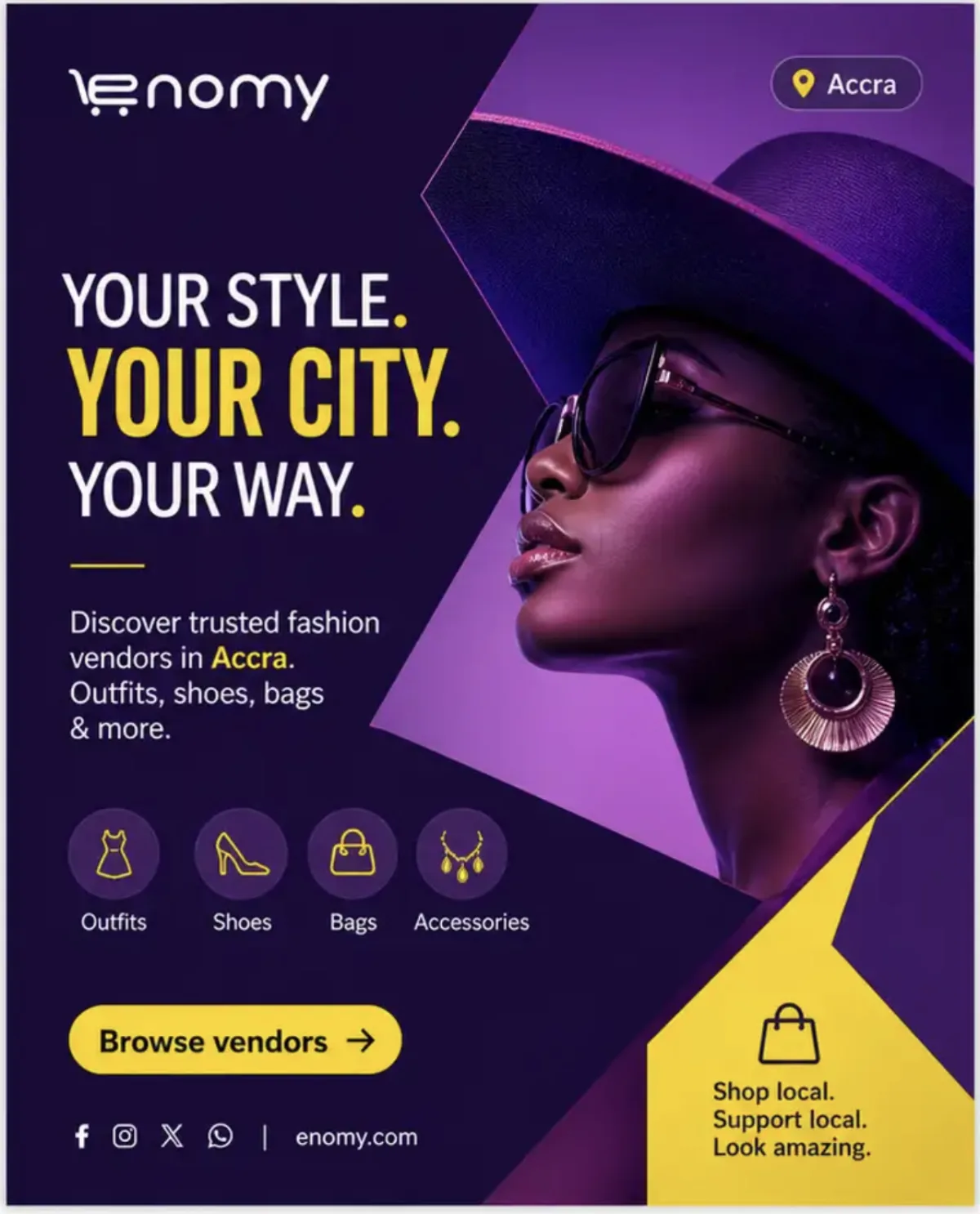
One large diagonal frame, an expressive accessory portrait and a simple left-hand copy column.
Multiple intersecting shards, a large yellow corner panel, split focal points and text too close to crop edges.
AI direction: use one decisive angle as structure, not a collection of decorative cuts.

A natural hand, one phone and one or two clearly related products inside the conversation.
Malformed fingers, invented WhatsApp controls, multiple profile bubbles and unreadable generated text.
AI direction: generate the hand and phone composition, then composite approved chat artwork.
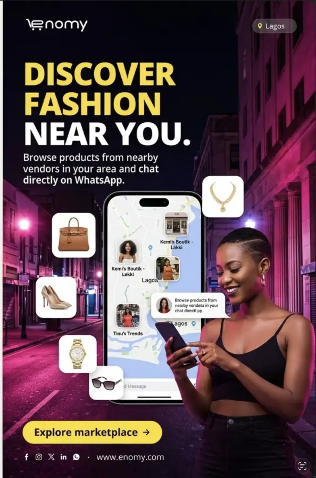
A simplified verified map, a small number of real location markers and products tied to those vendors.
Fake map geography, invented shop locations, neon streets, floating products and unreadable vendor labels.
AI direction: use a conceptual map only as a wireframe; production geography must be accurate.

Up to three real vendor previews with a consistent image crop, category label and clear browse action.
Invented business names, fake portraits, ratings, repeated body copy and a profile row that dominates the hero.
AI direction: use anonymous placeholders until approved vendor assets are supplied.
The reference image is evidence for a composition idea only. Generate from the written include and avoid guidance, then apply the Enomy rules below.
Treat each “Include” box as the source of truth. Do not copy every visible element from the image.
Never reproduce generated words, logos, vendor profiles, maps or phone screens. Composite approved assets later.
Counts, trust, verification, delivery and growth statements remain omitted until current evidence is approved.
Require natural skin, hands, anatomy, products, transport, landmarks and lighting before a visual enters layout.
These patterns combine the best lessons from the references without inheriting fabricated claims, fake interface elements or excessive decoration.
One large ring and two or three translucent bubbles behind the subject. Keep all shapes subordinate to content.
A compact, anonymized two-message exchange placed near the relevant product.
One dominant hero plus three category-consistent details with matching colour grade.
Real landmarks, transport or shop streets—accurate to the named place and protected by a dark overlay.
Close crop, visible product, natural texture and one category-specific proposition.
Use only for an approved fact or non-numeric category cue, and treat it as the single yellow focus.
A coherent product family with realistic materials, one light direction and room for a short headline.
A confident full-body or three-quarter subject whose hair, styling or pose reads instantly in the feed.
A curated grid of real, cleared vendors or products paired with a vendor-onboarding proposition.
Three to five category-related products, consistent scale and realistic overhead lighting.
Combine authentic local context with one accurate product or chat screen; select only one as the dominant hero.
Broaden beyond women’s fashion with tailored imagery and copy for men’s, beauty, home, electronics and other Enomy categories.
Start with Enomy Night, create depth with Ink Deep and Brand Ink, then use Primary and Magenta Glow as lighting or small details. A major campaign should not sit on a flat bright-purple field.
Use this order to establish hierarchy. Optional pieces may be removed; the core message must never become smaller to accommodate extra decoration.
Enomy logo, then one optional city or category chip.
Three to eight words, white headline and one yellow emphasis.
One person or focused product group, integrated with believable lighting.
Brief support, one CTA and optional URL. Remove social-icon rows unless required.
Do not crop one design into every ratio. Rebalance the subject, headline and negative space for the destination.
80 px safe perimeter. Use a balanced subject/headline split and keep the CTA clear of the bottom edge.
Preferred feed format. Use 80 px protection and reserve the lower area for one CTA or URL.
Keep essentials at least 160 px from top and bottom platform UI. Avoid small footer copy.
Use Open Sans Bold or ExtraBold. Supporting text should be significantly smaller and limited to one plain-language explanation.
Discover products near you.
Shop your city.
Fashion near you.
Browse products. Chat with vendors.
Help more shoppers discover your products.
“Verified,” “trusted,” “1,200+” or “fastest-growing.”
A final two-minute check protects the brand more effectively than adding another decorative layer.
Reference images on this page are critique material and may contain unapproved claims. They are not cleared for publication.
Transfer these production specs into Figma, Canva or another design tool. Each includes canvas, safe area, copy and asset requirements.
One canvas, one message
Redesign for each format instead of cropping one master. Use one headline, one CTA and one strong person or product focal point.
1:1
1080 × 1080
80 px safe area · 3–8 words
4:5
1080 × 1350
80 px safe area · preferred portrait
9:16
1080 × 1920
160 px top/bottom protection
Use relevant imagery, one yellow emphasis and one CTA.
Use unsupported claims, badge piles or several CTAs.